| |
|
Room 1 | Figuration and surrealism
Mark Rothko did not study painting in grade school or at university. He came to art in his mid-20s, when he attended a figure drawing class at the Art Students’ League in New York with a friend. Thus, almost by chance, his life-long love affair with, and untiring dedication to, visual art was launched. He began, as did all the abstractionists of his generation, by painting the figure: nudes, urban scenes, still lives, portraits. We see examples of all these genres in this gallery, the works chosen particularly to emphasize Rothko’s close ties to European history and art tradition.
The smallest works shown here are all made on gessoed panels, linking him to methods employed since the Renaissance, not least by the Florentines. The tiny odalisque painting Untitled (Woman Reclining on a Couch) recalls famous examples by Goya, Ingres and his beloved Matisse, while Interior’s architectural features could well hail from an ancient temple, mausoleum or indeed Michelangelo’s famed Medici tombs at San Lorenzo.
By the early 1940s Rothko had moved to a neo-surrealist style, propelled by references to classical myths of Greece, Rome, Babylon, and beyond. This provided him a path to the unconscious, a common language through which to engage his viewer. Hence, titled works such as Room in Karnak and Tiresias (over which he labored with particular intensity), which addressed core elements of our shared humanity. Similarly, these works often feature strange biomorphic figures and primordial creatures that also harken to our ancestral roots. These populate the watercolors from this period with particular frequency and poignancy. Note also the dynamism of these works; the freely drawn elements and the active scraping and rubbing of the canvas. These elements will essentially disappear from his later, color-field work and Rothko’s quest to communicate will be carried forward in new guises.
|
 |
Rothko a Firenze, exhibition view of the first roomv in Palazzo Strozzi, Firenze, 2026 [Photo Ela Bialkowska, OKNO Studio [1]
|
|
![Mark Rothko, Interior, 1936, oil on hardboard, 60.6 × 46.4 cm, Washington DC, National Gallery of Art, Gift of The, Mark Rothko Foundation, Inc.,, 1986.43.26, Cat. Rais. n. 79 [Rothko a Firenze, exhibition Palazzo Strozzi, Firenze, 2026]](https://lh3.googleusercontent.com/pw/AP1GczOsS1YfP0afYvyCx-uU05z6UPigo-9r1EI8PqaiioGbIRSLXYrSlDeTYxhr4eC0fJ4ODWcrRZw2MzpwuqOEKPnzadgqT93EDLIF2wG0stwIjdGu1Vr-=w1800-h2386-p-k) |
Mark Rothko, Interior, 1936, oil on hardboard, 60.6 × 46.4 cm, Washington DC, National Gallery of Art,
[Gift of The, Mark Rothko Foundation, Inc.,, 1986.43.26, Cat. Rais. n. 79]
[Rothko a Firenze, exhibition Palazzo Strozzi, Firenze, 2026]
|
Room 2 | Multiforms, pre-classic and early classic works
Some time in 1946, Rothko makes a relatively rapid transition from his neo-surreal style to what will become known as his Multiforms. The figures of the early years become increasingly abstracted until they dissolve altogether.
The paintings of 1946-47 can seem formless, with their many irregular patches in vibrant hues. In these first pure abstractions, the bold juxtapositions of color for which Rothko is known are dominant, but as we move into 1948 and 1949, form comes to play an essential role.
|
![Rothko a Firenze, exhibition view Palazzo Strozzi, Room 4, with Mark Rothko, Untitled 1948, Untitled 1946, No.11 / No. 20, 1949, No. 24, 1949 and
No. 3 / No. 13, 1949 [Photo Ela Bialkowska, OKNO Studio]](https://lh3.googleusercontent.com/pw/AP1GczPXXvr2Pu82BIrf21_Kdwupdp6WDwTvmruQI5Ys7IhTtCLU6m-BDmVZ8rdju_RMWgEYPwGKGBTjk7xZL50ciQHYqIqKfrDL9LVgqt4tt7QDVxwPzL5j=w2048-h1365-p-k) |
Rothko a Firenze, exhibition view Palazzo Strozzi, Room 4, with Mark Rothko, Untitled 1948, Untitled 1946, No.11 / No. 20, 1949, No. 24, 1949 and No. 3 / No. 13, 1949 [1]
|
| The surfaces become more organized, simplified, their communication more direct. They take on architectural qualities, perhaps inspired by the ancient Greco-Roman sites that Rothko will soon see in person. By the end of 1949, Rothko is painting in his well-known classic format, of which No. 3 / No. 13 is a striking early example.
|

|
Mark Rothko, No.3/No. 13 (1949; oil on canvas, 216.5 x 164.8 cm; New York, MoMA
The Museum of Modern Art, Bequest of Mrs. Mark Rothko through The Mark Rothko Foundation, Inc. 428.1981)
© 1998 by Kate Rothko Prizel and Christopher Rothko / Artists Rights Society (ARS), New York [3]
|
«No. 3/No. 13 is an early example of a compositional structure that Rothko would continue to explore for more than two decades. Narrowly separated blocks of color hover against a colored ground. Their edges are soft and irregular, so that when Rothko used closely related tones the blocks sometimes seem barely to emerge from the ground. The green bar in No. 3/No. 13, on the other hand, appears to vibrate against the orange around it, creating an optical flicker. In fact, the canvas is full of gentle movement, as blocks emerge and recede and surfaces seem to breathe. Just as the edges tend to fade and blur, the colors are never completely flat, and the faint unevenness in their intensity reveals the artist’s exploration of the technique of scumbling: by planting bold colors on top of a haze of translucent layers of paint, he created ambiguity, a shifting between solidity and impalpable depth.
The sense of boundlessness in Rothko’s paintings has been related to the aesthetics of the sublime, an implicit or explicit concern of a number of his fellow painters in the New York School. The remarkable color in his paintings was for him only a means to a larger end: “I’m interested only in expressing basic human emotions—tragedy, ecstasy, doom,” he said. “If you...are moved only by...color relationships, then you miss the point."»[4]
|
Room 3 | The 1950s
In the 1950s, Mark Rothko developed the visual language that would define his mature work. Moving away from mythological subjects and biomorphic forms, he focused on a new pictorial language characterized by two or three floating rectangles of color that seem to hover within the canvas. In 1950, Rothko travelled to Europe, visiting Venice, Florence, and Rome. The encounter with Italian art, from Giotto and Fra Angelico’s frescoes to Michelangelo’s Laurentian Library, left a lasting impression. The sense of balance and scale discovered in these works influenced Rothko’s approach to painting, even as he pursued a language free from representation. Through the 1950s compositions, Rothko explored how color and light could create a direct emotional experience for the viewer.
|
![Rothko a Firenze, exhibition view Palazzo Strozzi, third Room, Firenze, 2026 [Photo Ela Bialkowska, OKNO Studio]](https://lh3.googleusercontent.com/pw/AP1GczOmFnl4OYvc8vOgRH0UBiG2kxOhrIytzzAumrUBXH5v0oUpL2yeW7Gm6maU1DzKO5oP-bWrmqOz5PZI2ajcdUZnGkYGCO_MZ7wZecv0dPNoJ-c7r6Wj=w1398-h931-p-k) |
Rothko a Firenze, exhibition view Palazzo Strozzi, third Room, Firenze, 2026 [Photo Ela Bialkowska, OKNO Studio]
|
| The palette moves from bright yellows and reds to deeper, more subdued tones. The brushwork is soft and atmospheric, with layers of thin paint that allow for light to emerge from within the surface, as seen most typically in No. 12, 1951, and Orange and Tan, 1954. We see Rothko recognize the emotional immediacy of his paintings while resisting being defined by color alone. He denied the tranquility often attributed to his work, describing each surface as containing an intense, even violent, energy which pulsates within the canvas.
|
![Mark Rothko, No. 12, 1951 [Rothko a Firenze, exhibition Palazzo Strozzi, Firenze, 2026] [©1998 by Kate Rothko Prizel and Christopher Rothko / Artist Rights Society (ARS), New York / SIAE, Rome]](https://lh3.googleusercontent.com/pw/AP1GczOdWSbF7NOFsOv3xVAyGoj47vzGKimYDdr8ggdBKNIO5zZPrqP4fhs9r1rjT5vY61xyCu3tb1ZHocDMCzf8ghMbt_RZzLCpU29Du1UJ4cL3ImTWP5kM=w1200-h1286-p-k)
|
Mark Rothko, No. 12, 1951, oil on canvas, 146.05 × 135 cm, private collection of Christopher Rothko
[Estate inv. 5226.51 - Cat. Rais. n. 458]
©1998 by Kate Rothko Prizel and Christopher Rothko / Artist Rights Society (ARS), New York / SIAE, Rome
|
Room 4 | The mid–late 1950s
In the mid to late 1950s, Rothko’s palette shifted toward cooler, more subdued tones. The luminous reds and yellows of the earlier years gave way to deep greens and blues, signaling a new phase of introspection. In these works, color seems to turn inward, creating a dense atmosphere of suspension and quiet reflection.
During these years, Rothko began teaching at Brooklyn College and developed a close intellectual exchange with curator Katharine Kuh, who invited him to exhibit at the Art Institute of Chicago in 1954. Their correspondence reveals his belief that paintings should speak directly to viewers, without the filter of critical interpretation. “Silence,” he implied, was the most honest form of engagement with art, an idea that mirrors the meditative stillness of these green and blue works.
Between 1955 and 1957, Rothko exhibited more widely in the United States and eventually in Europe, gaining increasing recognition while defending the autonomy of his vision. His reading of Søren Kierkegaard and Sigmund Freud informed a deeper exploration of the psychological dimensions of color and space.
|
![Rothko a Firenze, exhibition view Palazzo Strozzi, with Mark Rothko, Untitled, 1955, and Untitled, 1957 [Photo Ela Bialkowska, OKNO Studio]a](https://lh3.googleusercontent.com/pw/AP1GczMArZo1g7pTdrhKZnzbvm1HmcVDQaympFPG18-YNH-xiUWQmURSSbB9OOZjf8gExSg6gTPnuOn3S_-PfF88GF-uQ9GJBbRt8FR9op-R5W1zjsg3CwuM=w2000-h1333-p-k)
|
Rothko a Firenze, exhibition view Palazzo Strozzi, with Mark Rothko, Untitled, 1955, and Untitled, 1957 [1]
|
![Rothko a Firenze, exhibition view Room 4 in Palazzo Strozzi, with Mark Rothko, No. 2 (Blue, Red and Green) [Yellow, Red, Blue on Blue)], 1953, and Untitled, 1957 [Photo Ela Bialkowska, OKNO Studio]](https://lh3.googleusercontent.com/pw/AP1GczPR2YEzp-aAoM6oYVTpXYipPOZ3YvTEua5SfUHyJ-B1n8w4txB34t-xwdBf3h76nwwssqEyf8Jriv_MDA-285pIWXlSK92_Y8XtKKQscm5t-fWAiHIj=w2560-h1920-p-k) |
Rothko a Firenze, exhibition view Room 4 in Palazzo Strozzi, with Mark Rothko, No. 2 (Blue, Red and Green) [Yellow, Red, Blue on Blue)], 1953, and Untitled, 1957 [1]
|
![Mark Rothko, No. 2 (Blue, Red and Green) [Yellow, Red, Blue on Blue)], 1953, oil on canvas, 205.7 × 170.5 cm[Estate inv. 5030.53 - Cat. Rais. n. 485] ©1998 by Kate Rothko Prizel and Christopher Rothko / Artist Rights Society (ARS), New York / SIAE, Rome]](https://lh3.googleusercontent.com/pw/AP1GczNNcqZE8a4AkoKEQdp5Kgv6L03nHAVTNTmtIWesaFO6FqWRu5i-VGGmY8v9yA-EM2Sr-BOf3VGcENHPJ6oWaMYrq8kh6sw2N0GITx80iqy6hFNC5dpl=w1458-h1758-p-k) |
Mark Rothko, No. 2 (Blue, Red and Green) [Yellow, Red, Blue on Blue)], 1953, oil on canvas, 205.7 × 170.5 cm
[Estate inv. 5030.53 - Cat. Rais. n. 485 ©1998 by Kate Rothko Prizel and Christopher Rothk
o / Artist Rights Society (ARS), New York / SIAE, Rome]
|
Room 5 | Sketches for Seagram Murals and classic canvases
The studies shown here, spanning from 1958 to 1962, chart the evolution of compositional structures that would later appear in the Seagram and Harvard mural cycles. In the Seagram Murals Studies, Rothko explored how closely balanced zones of tone could generate an architecture of quiet tension. Using tempera paint on textured sheets, he tested the proportions and intervals between forms, adjusting the weight of each plane to evoke a sense of inward pressure and enclosure. We observe in these works how his thinking about spatial relationships guided the development of his mural compositions. Notably these works coincide with Rothko’s 1950 and 1959 trips to Italy and his immersive experiences in the architectural spaces of Rome and Florence. Stripped of chromatic force, the accompanying drawings in ink and graphite from 1962, emphasize pause and the breathing space between forms. Together, they offer a glimpse into the precision and restraint that underpinned even the most monumental of his canvases.
|
Room 6 | Sketches for Harvard Murals
The studies gathered here trace Rothko’s transition from the Seagram commission to the Harvard Murals of 1962. Executed in ink, watercolor, and graphite on modest sheets of paper, these works articulate an austere architecture of feeling. At Harvard, Rothko sought to create an enveloping environment of color that would evoke, as he said, “death and resurrection.” The preparatory drawings reveal how he conceived these meditations as a cycle, an unfolding rhythm of dark and light. The alternating vertical bands and the double-sided watercolors suggest his continual revision of proportion and balance, as if the act of turning a page mirrored the shifting register of emotion itself.
Here, scale is replaced by concentration. The translucent washes and hesitant lines expose the physical immediacy of Rothko’s hand. These studies bear witness to an artist translating metaphysical ambition into fragile paper and ink.
|
![Mark Rothko, Untitled, 1959 [Collection of Kate Rothko Prizel and Ilya Prizel, Estate inv. 2119.59][©2025 by Kate Rothko Prizel and Christopher Rothko / Artist Rights Society (ARS), New York / SIAE, Rome]](https://lh3.googleusercontent.com/pw/AP1GczMgcF8bWB4I4dSQ-fl0-hbxvSczkU81LNjUtY-yTnKcuoSuNu69EL1Sfn__QZqOTzzKgrNoKE-frC4PAfAr3Mh5G1mqfhIHNb58QSHxJTrmIgTvL5q8=w912-h1212-p-k) |
Mark Rothko, Untitled, 1959, oil on watercolor paper, 96.5 x 63.5 cm
[Collection of Kate Rothko Prizel and Ilya Prizel, Estate inv. 2119.59]
[©2025 by Kate Rothko Prizel and Christopher Rothko / Artist Rights Society (ARS), New York / SIAE, Rome]
|
The 1959 Untitled oil on watercolor paper, though not part of the Harvard study series, belongs to this same moment, registering on a reduced scale the brooding chromatic weight and architectural compression that would soon unfold across the murals themselves.[2] [7]
|
Room 7 | The early1960s
In 1958, Rothko was commissioned to create a series of murals for the Four Seasons restaurant in the Seagram Building in New York, designed by Philip Johnson and Mies van der Rohe (sketches for which can be seen in Room 5). To fully conceive the paintings, he rented a former gymnasium on the Bowery, where he built scaffolding to match the proportions of the restaurant’s walls. Working on this scale led him to think of painting as a kind of architecture, an environment that could surround and absorb the viewer. Though he would ultimately withdraw from the commission, the paintings carry the architectural imprint of his earlier encounter with Florence. Rothko had been deeply influenced by Michelangelo’s Vestibule of the Laurentian Library, whose blocked windows and heavy stillness conveyed, for him, a distinct kind of emotional intensity.
“[Michelangelo] achieved just the kind of feeling I’m after,” Rothko observed. “He makes the viewers feel that they are trapped in a room where all the doors and windows are bricked up, so that all they can do is butt their heads forever against the wall.” The works in this room, executed in the years surrounding the Seagram project, share that same sense of compression and inward pressure. Broad fields of maroon, umber, and black seem to contain their own restrained force, as if light was struggling to breathe beneath the surface. Untitled, 1962 is, in fact, an early vision of the compositional format for the Harvard mural commission of that year.
|
![Rothko a Firenze, exhibition view Room 7 in Palazzo Strozzi, with Mark Rothko, Untitled [Harvard Murals Sketch], 1962, Untitled (Umber, Blue, Umber, Brown), 1962, and Gray, Orange, Maroon No. 8, 1960 [Photo Ela Bialkowska, OKNO Studio ©1998 by Kate Rothko Prizel and Christopher Rothko / Artist Rights Society (ARS), New York / SIAE, Rome]](https://lh3.googleusercontent.com/pw/AP1GczP99BkZELpna8kABHPvetQ-_LdLrEQxNYfuW8X-eyzWQFlgnK1G6RJCjIHg8PL46ZQt_c_G9Vu282rd-IOT_KIY1ovpBHZ7_U8WjcnyY8SmKOLCQxq1=w2560-h1707-p-k) |
Rothko a Firenze, exhibition view Room 7 in Palazzo Strozzi, with Mark Rothko, Untitled [Harvard Murals Sketch], 1962, Untitled (Umber, Blue, Umber, Brown), 1962, and Gray, Orange, Maroon No. 8, 1960 [1]
|
| |
![Mark Rothko, Untitled [Harvard Murals Sketch], 1962, oil on canvas, 236.9 × 144.1 cm., Private collection
[Cat. Rais. n. 731 - Estate inv. 5116.60][©1998 by Kate Rothko Prizel and Christopher Rothko / Artist Rights Society (ARS), New York / SIAE, Rome]](https://lh3.googleusercontent.com/pw/AP1GczPqfEfKshjyDL22gG9Ehm004IfoBCdfRsKX_bnjKwcTY6bVBhTgP_WloDbhcsB3bY4XMwWX-rApKF0BUtMoBLXia6tNuB4SskyvpjYCObMVBI-62ZFh=w1800-h2258-p-k) |
Mark Rothko, Untitled [Harvard Murals Sketch], 1962, oil on canvas, 236.9 × 144.1 cm., Private collection
[Cat. Rais. n. 731 - Estate inv. 5116.60]
|
![Mark Rothko, Gray, Orange, Maroon No. 8, 1960, oil on canvas, 229 × 258.5 cm, Rotterdam, Collection Museum Boijmans van Beuningen, 2764 (MK)
[Cat. Rais. n. 674][©1998 by Kate Rothko Prizel and Christopher Rothko / Artist Rights Society (ARS), New York / SIAE, Rome]](https://lh3.googleusercontent.com/pw/AP1GczMtbQVHkoM4v24RHPIa0GR2UdAS-x9bcz32k0HCXbJZ6b3_g-WN5eBSMK6njJKyEpGUXgnZweFUN3yAYopGgFOVufgvCU7YIQ712KwWRdnRrn44bZYX=w2000-h1767-p-k)
|
Mark Rothko, Gray, Orange, Maroon No. 8, 1960, oil on canvas, 229 × 258.5 cm,
Rotterdam, Collection Museum Boijmans van Beuningen, 2764 (MK)
[Cat. Rais. n. 674][©1998 by Kate Rothko Prizel and Christopher Rothko / Artist Rights Society (ARS), New York / SIAE, Rome]
|
Room 8 | The late 1950s–early 1960s
In the late 1950s and early 1960s, Rothko’s palette deepened into a range of denser more saturated reds. In 1958, Rothko represented the United States at the Venice Biennale, alongside David Smith, Mark Tobey, and Seymour Lipton. The exhibition revealed a decisive shift in his painting with the emergence of the dark red and brown tonalities that would define many canvases of the coming decade. The following year, he travelled again through Italy, visiting sites such as the temples at Paestum and the frescoes of Pompeii, that would continue to inspire him. The deep, weathered reds of Roman walls and the enveloping stillness of those spaces profoundly marked his sense of color and scale. We can trace those impressions through the works in this gallery. The thin layers of pigment vary from dull brick to glowing crimson, creating a space of compressed luminosity and evoking a meditation on the endurance of light within darkness. These canvases confront the viewer with a concentrated intensity, where human emotion is held at the edge of darkness. During the early 1960s, Rothko’s international recognition grew, with retrospectives at the Museum of Modern Art in New York (1961) and major European institutions such as the Whitechapel Gallery in London (1961).
|
![Rothko a Firenze, exhibition view Room 8 in Palazzo Strozzi, with Mark Rothko, Four Darks in Red, 1958, Untitled (Black, Red Over Black on Red), 1964, No. 1 (Grayed Olive Green, Red on Maroon / Untitled), 1961, and Light Red Over Black, 1957 [Photo Ela Bialkowska, OKNO Studio]](https://lh3.googleusercontent.com/pw/AP1GczNERGk7QrBNm1s4lmirOjRSPlvp9CIlS1NXDgeS_y5as_bn8Pwb6RnXAKZ_9_hh4DqaZvtKSBDY-OKRmxF_-t8kLp7omp8OFGkYLOsX9t-n5uUnpenu=w2048-h1365-p-k) |
Rothko a Firenze, exhibition view Room 8 in Palazzo Strozzi, with Mark Rothko, Four Darks in Red, 1958, Untitled (Black, Red Over Black on Red), 1964, No. 1 (Grayed Olive Green, Red on Maroon / Untitled), 1961, and Light Red Over Black, 1957 [1]
|
«Four Darks in Red exemplifies Mark Rothko’s darker palette of the late 1950s, when he increasingly used red, maroon, and saturated black paints. Four dark rectangular areas of different proportions dominate the composition, simultaneously emerging from and receding into a luminous red ground. Rothko’s method of layering many coats of paint, along with the special reflective qualities of his color mixtures, gives his paintings an inimitable depth and incandescence. When this nearly ten-foot wide canvas is seen close up (as the artist intended), the viewer is engulfed in an atmosphere of color and intense visual sensations. The weightiest dark color is at the top of the canvas while a softer roseate glow emanates from below, creating a reversal of visual gravity. Rothko believed that such abstract perceptual forces had the ability to summon what he called “the basic emotions—tragedy, ecstasy, and doom.”»[6]
|
![Mark Rothko, Four Darks in Red, 1958, New York, Whitney Museum of American Art [©1998 by Kate Rothko Prizel and Christopher Rothko / Artist Rights Society (ARS), New York / SIAE, Rome]](https://lh3.googleusercontent.com/pw/AP1GczMGW-UHgPcKy9P3oxBsJugnboqQHHe-0Bddc20jIXkJfqd5KhSiQQsjZ0nYqXiKiTuuknHAIAwDZvJRDCPcXcpn0KlzlM2NwwFUl1ZzbXBQ58nhOnfX=w2000-h1750-p-k) |
Mark Rothko, Four Darks in Red, 1958, New York, Whitney Museum of American Art
[©1998 by Kate Rothko Prizel and Christopher Rothko / Artist Rights Society (ARS), New York / SIAE, Rome]
|
Room 9 | The late 1960s
Much of the last decade of Rothko’s career was occupied with public commissions, which inspired him to paint in series. We have gleaned aspects of these projects in the studies for the Seagram and Harvard murals in the previous galleries and can see further examples in the continuation of this exhibit at the Laurentian Library. 1964–67 would be wholly occupied with the monumental (posthumously titled) Rothko Chapel. In the years following his work on the Chapel, Rothko painted almost entirely on paper but quickly pivoted to canvas in 1969 when UNESCO sought to engage him and Alberto Giacometti to create a room in their Paris headquarters. Devising a new variation on his classic style and employing acrylic paint for the first time on canvas, Rothko proceeded to make a series ofeighteen Black and Grey paintings, well in excess of UNESCO’s commission, which was never finalized. The paintings are notable for the active brushwork and turbulent grey fields; the works framed for the first time in a white border that clearly defines the picture plane.
|
![Rothko a Firenze, exhibition view Room 9 in Palazzo Strozzi, with Mark Rothko, Untitled, 1969 and Untitled 1969 [Photo Ela Bialkowska, OKNO Studio ©1998 by Kate Rothko Prizel and Christopher Rothko / Artist Rights Society (ARS), New York / SIAE, Rome]](https://lh3.googleusercontent.com/pw/AP1GczMU28s3ZjQQw9_y0gHRTou989UC7iLSZJ3T96IIliLCFJgRiR9MMF2wu5z1fUukuwLT8vF7T8-9SdLlkmogPlxC1-PZDnR1v9aVQpnxO4FrISZj9Ax-=w2000-h1333-p-k) |
Rothko a Firenze, exhibition view Room 9 in Palazzo Strozzi, with Mark Rothko, Untitled, 1969 and Untitled 1969 [1]
|
| |
![Mark Rothko, Untitled, 1969 [Rothko a Firenze, exhibition in Palazzo Strozzi ©1998 by Kate Rothko Prizel and Christopher Rothko / Artist Rights Society (ARS), New York / SIAE, Rome]](https://lh3.googleusercontent.com/pw/AP1GczPSU5_vp67JgKKKntxp5F0qK0W_oTvddeOK2Uhy41wFNoxlziiedjG6uCLITgVWyorbD8X7GLQ2XNldFjuKx_5SYRoVLvDf3tBVYNYJXkcD1qZ0p3uB=w2000-h1857-p-k) |
Mark Rothko, Untitled, 1969
|
The exhibition concludes with works from the 1960s and the *Black and Gray* series (1969–1970), alongside his final works on paper, in which his painterly exploration achieves a synthesis of introspection and rigour through more subdued and profound tones.
Room 10 | Late works on paper
In the last months of his life, while working on the Black and Grey canvases, Rothko madethree series of large scale works on paper. Some in tones similar to those canvases, some sodark they need several minutes to be fully perceived, some in gentle, ethereal washes of nearlypastel color.Dominated by soft blues, rose-tinted earths, and terracotta tones, the chromatic range evokesa Quattrocento sensibility, as if Rothko were engaging with an archaic, contemplative mode ofpainting, distilled to its essentials. These are amongst Rothko’s most personal utterances.Inward turning, with a quiet yet palpable beauty, they invite a spiritual journey for the viewer,parallel to the artist’s own
|
![Rothko a Firenze, exhibition view Room 10 in Palazzo Strozzi, with Mark Rothko, Untitled, 1969, acrylic paintings on wove paper [Photo Ela Bialkowska, OKNO Studio]](https://lh3.googleusercontent.com/pw/AP1GczOFHkKeOFSoOlAUoRsP4ycwBC9Wsvs8pvUQTXCVNr9Bn3NoKEAmGJzs7KQbKsKv4YummMjHA-qQodZOwS9vk3l2fzg6S-GJ8eCq2KHE4D8W1-59I8Eu=w2000-h1333-p-k)
|
Rothko a Firenze, exhibition view Room 10 in Palazzo Strozzi, with Mark Rothko, Untitled, 1969, acrylic paintings on wove paper [1]
|
|
![Rothko a Firenze, exhibition view Room 10 in Palazzo Strozzi, with Mark Rothko, Untitled, 1969, acrylic paintings on wove paper [Photo Ela Bialkowska, OKNO Studio]](https://lh3.googleusercontent.com/pw/AP1GczOaooAJooXYGyoGUg1Z4ELxJKF4aBKqkagsFyRYlxHEirGeMQhb8dyXMRsI_h_7XQIZKRSm5NWnskdO8vlfWyildT5bj-3rM4EmHzRZD7Cz402qTqae=w2048-h1365-p-k) |
Rothko a Firenze, exhibition view Room 10 in Palazzo Strozzi, with Mark Rothko, Untitled, 1969, acrylverfschilderijen op geschept paper [1]
|
![Mark Rothko, Untitled, 1969, acrylic on wove paper, 183.5 × 97.9 cm [Collection of Christopher Rothko, Estate inv. 2062.69][Rothko a Firenze, exhibition in Palazzo Strozzi ©1998 by Kate Rothko Prizel and Christopher Rothko / Artist Rights Society (ARS), New York / SIAE, Rome]](https://lh3.googleusercontent.com/pw/AP1GczOF6kig_ws4ZTgPOf7w_olg1BQavq0OSCGM2_gXJysQatvVDRSJ4oHnT9GXrlg-SxEuHXI_KhnhH5w6Kf0uN6R46AsElwm1yumooJ19rbTZq9-byzRW=w1800-h3400-p-k) |
Mark Rothko, Untitled, 1969, acrylic on wove paper, 183.5 x 97.9 cm
[Collection of Christopher Rothko, Estate inv. 2062.69]
|
| |
| |
Mark Rothko in Florence
March 14 - July 26 2026
Palazzo Strozzi
Piazza degli Strozzi, Firenze
www.palazzostrozzi.org
|
Mark Rothko in previous exhibitions at Palazzo Strozzi
|
![Helen Frankenthaler, Dipingere senza regole, Palazzo Strozzi, Firenze, veduta della sale 4, con Mark Rothko, Untitled (Senza titolo), 1949 [© Photo Ela Bialkowska OKNOstudio]](https://lh3.googleusercontent.com/pw/AP1GczNKRxOrbNKYG3g8z7niANhyPBTaUw9PYArp8GHr6B6-TfpCYWEK2Q7p0OtsWUHmWtM2N7TF-b4542UGysorxXBR9wDe34ZSh6pZ_2QuFLOhuNAxRGvC=w2508-h3762-p-k) |
Helen Frankenthaler, Dipingere senza regole, Palazzo Strozzi, Firenze, veduta della sale 4,
con Mark Rothko, Untitled (Senza titolo), 1949 [1] |
![American Art 1961-2001, Palazzo Strozzi, Firenze. Veduta delle sale, con Louise Nevelson, Sky Cathedral Presence, 1951-1964, e Mark Rothko, No. 2, 1963 [© photo Ela Bialkowska OKNO Studio]](https://lh3.googleusercontent.com/pw/AP1GczOks9747K66J6bxHppD6vHPxgapEwrD-N-mkX9GTzpbwhprUBhFgv0gGYO0VNcKec942ZFIUGmIvfwgB-20HHhEHGl__gPO5Brl1h_JbPIBwT0PAelb=w800-h920-p-k) |
Mark Rothko , No. 2, 1963, Minneapolis, Walker Art Center. Dono Mark Rothko Foundation, Inc. 1985
© 1998 Kate Rothko Prizel & Christopher Rothko / ARS, New York [American Art 1961-2001, Palazzo Strozzi, Firenze] [1]
|
| |
|
|
| |
|
Mark Rothko and Fra Angelico
Throughout his life, Rothko engaged with philosophical, aesthetic and historiographical issues, constantly redefining and questioning his own position as an artist. His ideas reveal his involvement with and research into early Italian painting, particularly that of Giotto di Bondone (12641337) and Fra Angelico. His numerous trips to Italy allowed him to admire the works of Giotto and Beate Angelico in situ.
During his first trip to Europe in 1950, Mark Rothko found deep inspiration in Fra Angelico's frescoes in the monastery of San Marco in Florence. Fra Angelico's ecclesiastical commissions, painted in the fifteenth century, were also expressions of his faith and devotion. Rothko was impressed by the subtle way in which the artist used light and colour, and how his frescoes invited contemplative viewing.
For Rothko, the frescoes reflected what Hegel described as the invention of artistic interiority. This experience offered Rothko a gateway to emotional transcendence, which formed the impetus for his own work. It was the meditative and inner atmosphere in the frescoes of San Marco that Rothko hoped to evoke himself, and with which he defined his artistic conception of space: Rothko imagined chapel-like spaces in which the traveller or traveller could contemplate one detail of a painting in a small room.
Throughout his life, Rothko insisted that he was not an abstract painter. He controlled the hanging of his works and called his paintings murals, analogous to the Italian technique of fresco painting.
In 1957, he wrote, I am interested only in expressing the basic human emotions - tragedy, ecstasy, doom, and so on [...]. The people who weep before my pictures are having the same religious experience I had when I painted them.[5]
|
Palazzo Strozzi, Florence
|
|
|
|
|
 |
|
 |
|
 |
Palazzo Strozzi, Firenze
|
|
Museo di San Marco, veduta posteriore
|
|
Beato Angelico, la grande mostra a Palazzo Strozzi, Firenze
|
Exhibitions Palazzo Strozzi, a selection
Angelico, Fondazione Palazzo Strozzi, Firenze, 26 September 2025 - 25 January 2026
Tracey Emin. Sex and Solitude, Palazzo Strozzi, Firenze, 16 March 2025 - 20 July 2025
Helen Frankenthaler, Dipingere senza regole. Palazzo Strozzi, Firenze, 27 September 2024 - 26 January 2025
American Art 1961-2001, The Walker Art Center Collections, from Andy Warhol to Kara Walker, Fondazione Palazzo Strozzi, 28 May 2021 - 29 August 2021
The exhibition brings together an outstanding selection of more than 80 works by 53 artists including Andy Warhol, Mark Rothko, Louise Nevelson, Roy Lichtenstein, Claes Oldenburg, Bruce Nauman, Barbara Kruger, Robert Mapplethorpe, Cindy Sherman, Matthew Barney, Kara Walker and many more.
|
|

|
|
|
 |
|
![Olafur Eliasson, Solar compression, 2016. Fondazione Palazzo Strozzi, Florence 2022
[Photo: Ela Bialkowska, OKNO Studio. Courtesy Fondazione Palazzo Strozzi, Florence]](https://lh3.googleusercontent.com/pw/AP1GczM-YUTyoOj-8v6Ymvgp48K56esxlziY9qY2lLLJwYSd5J6GJdbc2Gch38PIaP_269UzVt1qBMghoalE5PP4ow8dAzi_4A24uMLAUqUiGp7-WQ5Kj08l=w700-h467-p-k) |
|
 |
Helen Frankenthaler, Dipingere senza regole. Palazzo Strozzi, Firenze
|
|
Olafur Eliasson, Solar compression, 2016. Fondazione Palazzo Strozzi, Firenze 2022
|
|
Marina Abramovic, The Cleaner, Palazzo Strozzi, 2018
|
![American Art 1961-2001, Palazzo Strozzi, Firenze. Veduta delle sale Crossing Boundaries, con un focus su Merce Cunningham, John Cage, Robert Rauschenberg e Jasper Johns [© photo Ela Bialkowska OKNO Studio]](https://lh3.googleusercontent.com/pw/AP1GczMftAJ6JpW5rn0E9Em3nxB9XufdX4rWnk0O49MlEO0KhWUH8XgI9M-pVNj5VHp_s0WNtB3l9Seg0xRtR9uhUYgflohU4x_FJGiGugdt6q8iaUabit9d=w1000-h600-p-k) |
|
![American Art 1961-2001, Palazzo Strozzi, Firenze. Veduta delle sale, con Louise Nevelson, Sky Cathedral Presence, 1951-1964, e Mark Rothko, No. 2, 1963 [© photo Ela Bialkowska OKNO Studio]](https://lh3.googleusercontent.com/pw/AP1GczM8mzVNGUql4Mo-Mr-N2tgoO1YUz0JfmBg4ehUeuqy_lWkfCcAsYiQwEWolH4hcXTFgGm5JU30d0PUjod9RFQzxMACBY4bK5CB5UJhS55w3bvtGuhK6=w900-h601-p-k) |
|
![American Art 1961-2001, Palazzo Strozzi, Firenze. Veduta delle sale Crossing Boundaries, con un focus su Merce Cunningham, John Cage, Robert Rauschenberg e Jasper Johns [© photo Ela Bialkowska OKNO Studio]](https://lh3.googleusercontent.com/pw/AP1GczNhbON3r_3P9VV_EW8vHO0x6kZP-NQbHh13xoNGmBkh9TTCkHeN9xPCgcj-Rv-ejj-c5u2-fVcxBnArK4GiIJOqkiSRn2go_RvYld5FGIU40NZ4k1fQ=w600-h560-p-k) |
American Art 1961-2001, Palazzo Strozzi, Firenze. Veduta delle sale, Crossing Boundaries, con un focus su Merce Cunningham, John Cage, Robert Rauschenberg e Jasper Johns
|
|
American Art 1961-2001, Palazzo Strozzi, Firenze. Veduta delle sale, con Louise Nevelson, Sky Cathedral Presence, 1951-1964, e Mark Rothko, No. 2, 1963
|
|
American Art 1961-2001, Palazzo Strozzi, Firenze. Veduta delle sale Crossing Boundaries, con un focus su Merce Cunningham, John Cage, Robert Rauschenberg e Jasper Johns
|
| |
|
|
|
|
| |
|
|
|
|


|

Artists in residence
Trova la casa perfetta per la tua vacanza | Tuscan Holiday houses | Podere Santa Pia
|
|
|
 |
|
 |
Celebrare il dolce far niente
|
|
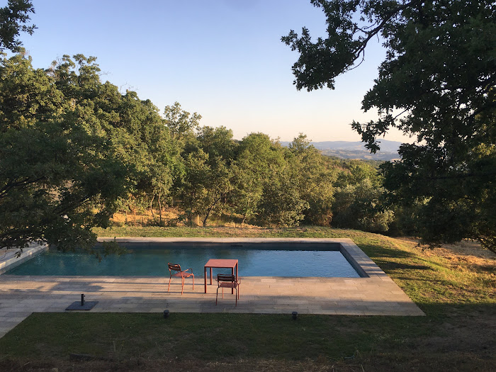
A beautiful early evening by the pool, in the resplendent Tuscan sun, time takes on a languid quality
|
|
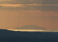
Visia da Podere Santa Pia, fino al mare e Montecristo
|
 |
Reflections on the pool: Tuscan designs for swimming
|
 |
|
| |
|
|
|
|
Christopher Rothko, lecture “Mark Rothko and the inner world”, AGO, 2025.
|

[0] Photo by Consuelo Kanaga [www.brooklynmuseum.org, No restrictions, Link]
This image was uploaded by the Brooklyn Museum as a content partnership, and is considered to have no known copyright restrictions by the institutions of the Brooklyn Museum.
[1] Rothko a Firenze, exhibition views, Palazzo Strozzi, Museo di San Marco, Biblioteca Medicea Laurenziana, Firenze, 2026. Photo Ela Bialkowska, OKNO Studio
[2] This article is based on the press release from Palazzo Strozzi | [Palazzo Strozzi, press area | www.palazzostrozzi.org/press-area]
[3] Mark Rothko, No.3/No. 13 (1949; oil on canvas, 216.5 x 164.8 cm; New York, MoMA The Museum of Modern Art, Bequest of Mrs. Mark Rothko through The Mark Rothko Foundation, Inc. 428.1981) © 1998 by Kate Rothko Prizel and Christopher Rothko / Artists Rights Society (ARS), New York.
[4] Excerpt from the publication MoMA Highlights: 375 Works from The Museum of Modern Artn (New York: The Museum of Modern Art, 2019)
[5] Mark Rothko, Four Darks in Red, 1958 | www.whitney.org/collection
[7] Stenger, J., Khandekar, N., Wilker, A., Kallsen, K., Kirby, D. P., & Eremin, K. (2016). The making of Mark Rothko’s Harvard Murals. Studies in Conservation, 61(6), 331–347 | www.doi.org
|
![Rothko a Firenze, exhibition in Palazzo Strozzi, with Mark Rothko, Mark Rothko, Harvard Murals Study, 1962, watercolor on construction paper, 18.3 × 31.1 cm [Collection of Kate Rothko Prizel and Christopher Rothko, Estate inv. 91.83 ©2025 by Kate Rothko Prizel and Christopher Rothko / Artist Rights Society (ARS), New York / SIAE, Rome]](https://lh3.googleusercontent.com/pw/AP1GczMYCqPmj6DQCD7Goi4S51fOpkZ3Mfrs6GUZ4IGxDpSnXC3HuhLIvU8OcfSjyJydmuLvQRbXpXZ_DTIuraHRaTtymdpHGKnqg4DQwe07e9xfuuQUhry8=w1200-h698-p-k) |
Mark Rothko, Harvard Murals Study, 1962, watercolor on construction paper, 18.3 × 31.1 c
[Collection of Kate Rothko Prizel and Christopher Rothko, Estate inv. 91.83 ©2025 by Kate Rothko Prizel and Christopher Rothko / Artist Rights Society (ARS), New York / SIAE, Rome] m
|
| |
|
|


![Rothko a Firenze, exhibition view Biblioteca Medicea Laurenziana, Firenze, 2026 ÛPhoto Ela Bialkowska, OKNO Studio]](https://lh3.googleusercontent.com/pw/AP1GczM_C5fZTvKT-p4m1Rzae819ywOsi72DhCNttYauceBMT70xpKGVr3_yOvxZbOwYxmW_9SbnZYoSu-HBnaurnOzZxclVXM-8lFaPidnQsGFPozUoG-dN=w2000-h1333-p-k)
![Rothko a Firenze, exhibition view Museo di San Marco, cell 1, with Mark Rothko
[Untitled], 1958, Firenze, 2026 [Photo Ela Bialkowska, OKNO Studio]](https://lh3.googleusercontent.com/pw/AP1GczP3NjIvhczdRUevzpaaW0lG_jcnPXgAGRyjMe448_ThJ2xzBjdMOzbiGC7RfoKoKcI3699SYjfJSrBPAdDV3-y5zVyOAZ44O-gukD5oqzsRc4Fy8KMZ=w2000-h1333-p-k)